
Trigger the modal
AppKit’s web components are custom and reusable HTML tags. They will work across modern browsers, and can be used with any JavaScript library or framework that works with HTML.Web components are global html elements that don’t require importing.
List of optional properties for AppKit web components
<appkit-button />
<appkit-account-button />
<appkit-connect-button />
<appkit-network-button />
React Components
AppKit provides React-specific components that integrate seamlessly with your React application. These components automatically reflect the AppKit state and provide a more React-native experience.<AppKitButton /> and <AppKitNetworkButton />
These React components provide the same functionality as the web components but with better React integration and TypeScript support.
Props
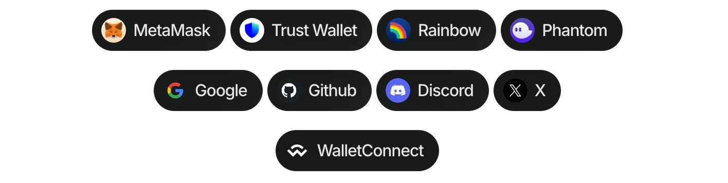
Both components accept the following optional props:<appkit-wallet-button />
- Install the package:
- Import the library in the project:
- Use the component in the project:
Multichain Support
You can specify a blockchain namespace to target specific chains:React Hook Integration
You can also use theuseAppKitWallet hook for programmatic wallet connections with multichain support: